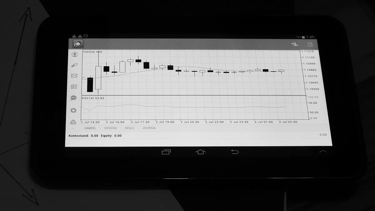
Open a candlestick chart for the first time and it looks like a barcode someone left in the sun. Give it an afternoon and the shapes start to talk. Each candle squeezes four numbers — open, high, low, close — into one small block, and that is the whole trick. Once you can read those four at a glance, you can tell who was in charge during that period, where the fight happened, and who gave up first.
Why candles beat a simple line
A line chart tells you where a market finished each period. Useful, but thin. A candle tells you the journey: where it opened, how far it ran, where it got pushed back. That is the difference between knowing a share closed higher and knowing it closed higher only after spiking 4% and handing most of it back. For judging whether a move has conviction behind it, the second version is far more useful. The vocabulary is tiny — body, wick, colour — and it works the same on the FTSE 100, a gilt future or cable.
The anatomy of a candle
The body is the distance between the open and the close. A long body means one side dominated the period. A short body means a stalemate. The colour tells you the direction: bullish if the close finished above the open, bearish if below. Platforms vary — some use green and red, others white and black — so check your settings before you read anything into it.
The thin lines above and below the body are the wicks, sometimes called shadows. They mark the high and the low. A long upper wick says prices were bid up and then rejected; sellers took control before the close. A long lower wick is the mirror image, where sellers pushed price down and buyers absorbed everything they had. A candle with no wicks at all is rare, and it means one side never lost control for a moment.
One detail trips up beginners: if a share gaps overnight on results, the new candle's body starts from the fresh open, not the previous close. The empty space between them sits on the chart as a gap, and it matters. A long bullish candle built from a continuous rise is a different animal from one that simply started higher.
Six patterns worth learning first
- Doji — open and close almost identical, so the body is a sliver. Indecision, nothing more.
- Hammer — small body at the top of a long lower wick, appearing after a fall. Buyers rejected the lower prices.
- Shooting star — the reverse, at the top of a rally. Sellers rejected the highs.
- Bullish engulfing — a down candle followed by an up candle whose body completely covers the previous one.
- Bearish engulfing — the mirror image, at the end of an advance.
- Inside bar — the whole range sits inside the previous candle's. Compression, often before a move in either direction.
Learn these six properly rather than skimming thirty. Most of the named patterns you will find online are variations on three ideas: rejection, indecision and a shift in control.
Context decides whether a pattern means anything
A hammer in the middle of a drifting range is just a candle. The same hammer landing on a level that has held three times before, after a sustained fall, with volume picking up, is worth attention. So mark the levels that matter before you read any candle: recent highs and lows, round numbers, the previous session's range. Then ask what the candle is doing at that level. Trend counts as well. Reversal patterns fight the prevailing trend and fail often; continuation patterns in a strong trend tend to behave better.
How UK market hours shape what you see
London equities open at 08:00, and the first twenty minutes are the noisiest of the day. The opening auction unwinds, overnight orders work through, and spreads are still settling. Candles from that window are wide and unreliable. By mid-morning, when European markets are fully engaged, trends are usually cleaner and patterns carry more weight.
Lunchtime in London — roughly 12:00 to 13:00 — is a lull. Volume drops, candles shrink, and breakouts from that period frequently fail. Treat them with suspicion unless something else supports the move.
Then comes 14:30, when Wall Street's cash session begins. This is when range and volume expand sharply, and a good share of what looks like a London move is really a New York move. For most of the year that open lands at 14:30 UK time, shifting by an hour for a few weeks each spring and autumn when the two countries change their clocks on different dates.
The 16:30 close brings its own distortions. Closing auctions, index tracking funds and rebalancing flows can produce odd spikes in the final minutes, particularly at quarter-end, on expiry days and during index reviews. Do not read a pattern into the last candle of a rebalance day.
Two further quirks are worth knowing. The FTSE 100 is heavy in miners, oil majors, banks and overseas earners, so a move in sterling can shift the index without much happening in the underlying shares. And on thinly traded small caps, a candle may reflect nothing more than the spread — a few thousand shares crossing can paint a dramatic shape on almost no real activity. Aim-listed names are especially prone to this.
Mistakes that cost beginners money
- Reading one candle in isolation, as though it were a signal on its own.
- Ignoring the timeframe. A bullish engulfing on a one-minute mid-cap chart is mostly noise.
- Forgetting volume. A pattern on quiet volume is a weak pattern.
- Overlooking the spread. On an illiquid share, dealing costs can swallow any edge the pattern suggests.
- Waiting for textbook perfection. Real candles are messy; perfect ones are often hindsight.
- Treating a pattern as a certainty rather than a slightly loaded probability.
- Never writing anything down, so the same mistakes repeat every month.
A routine you can actually keep
Pick one market, one timeframe and two or three patterns. Mark your levels before the open rather than after. Check the volume behind anything that catches your eye. Write down the setup, the level and what you expect to happen, then review it at the weekend. You will be wrong often — that is normal. The point is to find out whether your reading of a chart gives you a small edge once dealing costs are taken into account.
Keep it simple for a few months before adding anything. A trader who understands four patterns and their context will usually fare better than one who half-remembers forty.
Nothing here is personal financial advice. Trading carries risk, and if you are unsure whether it suits your circumstances, speak to a regulated adviser.
Photo: PIX1861 / Pixabay